

~We are still in the process of calibrating our printed colors to our new system. If you would like to know the ΔE value for a color that currently shows “TBD” on the product page, please Contact Us~
How We Calibrate Our Printed Colors
We use a commercial-grade color spectrophotometer scanning tool to eliminate as many variables in the calibration process as possible. This allows us to take the human factor and guess-work out of the equation, optimizing initial calibration and color replication on future prints, thus saving time and materials on every order. It also allows us to create and share a somewhat-standardized “level of confidence” in how close our printed colors are to the paints we’re trying to match them to, better helping our customers purchase a vinyl wrap that they will be happy with for many years.
Lighting Temperature
Light interacts with every material differently, and as lighting color shifts it can change the appearance of different materials (in our case, printed vinyl versus paint) relative to each other. For example, here is a rendering showing how different the appearance of just one shade of white paint can appear on a wall depending on the lighting in the room.
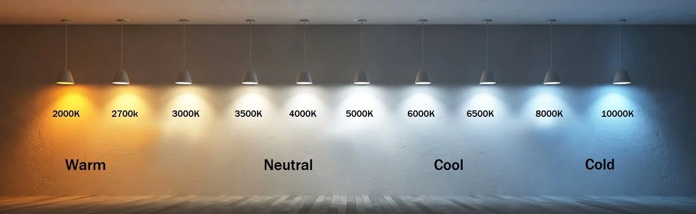
This creates a bit of a challenge - all houses don’t have the same lighting temperature in them, and there’s no easy way for your average person to know exactly the temperature of lighting in their home. The best we can do in this case is pick a middle ground, or average of typical lighting conditions, and standardize our calibration and printing processes to that for consistency.
In the printing world, the most widely accepted lighting average is known as D50 lighting (“mid-day” light, or ~5000k light temperature). This is the standard we follow for calibrating our printed colors. If you receive one of our color samples and it appears very far off from the paint you’re comparing it to (and it is not otherwise noted on our product pages), the most likely culprit is the lighting in your home - this is the biggest factor in why we recommend ordering samples first.
Color Breakdown
Lighting and color appearance, and how one effects the other is a very complex subject. Simply put however, it is the scientific breakdown of a color into key elements - how light it is, how saturated it is, how warm or cool-toned it is, etc. All of these variables are given numeric values, and then can be used for color comparison.
The most widely-used and standardized color comparison system used in color replication across multiple industries is CIE ΔE2000. This is the system we use to compare our printed colors to paint. In this system, each aspect (lightness, saturation, etc.) is compared, and given a numeric value representing degrees of variance. This is done for multiple values, and then all averaged together to boil down to a single number value - the ΔE value, or “delta E”. The closer to 0 the ΔE value is, the closer the two colors are to being identical.
What Delta E Values Mean
We can then use this ΔE value (roughly) as a “level of confidence” that our printed color will be a close match to the named paint color in your average home. Our number scaling is as follows:
✅ Δ E ≤ 1.0: VERY close match - most likely only noticeable if one color is laid directly on top of/is surrounded by the other, otherwise they will appear essentially identical to the human eye. Colors that we get under a value of 1 will match better at wider viewing angles, and should match better under a wider range of lighting conditions.
⚠️ Δ E 1.0-2.0: Okay match, but if being used on an appliance next to same-color cabinets, a difference will be noticeable. These colors are better used as contrast/accent colors.
🚫Δ E > 2.0: Noticeable color error - most likely caused by our ink/vinyl being limited in hitting a target brightness or saturation. If the closest we can get with a color has a ΔE over 2, we usually reject it outright.
Unfortunately every color doesn’t behave exactly the same, and if your home lighting leans far towards the warm or cold ends of the lighting spectrum it is less likely that our printed colors will closely match the named paint colors, so we always recommend ordering samples of our printed colors before a full wrap.